

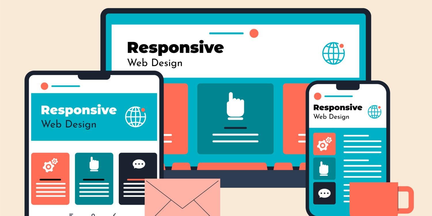
In 2026, the digital environment is one of extreme device diversity. Consumers are not just surfing the web on traditional smartphones or laptops anymore. They engage with your brand on foldables, tablets, dual-screen workstations, smart watches, and spatial computing.
In this ecosystem, Responsive Web Design (RWD) has evolved from a technical luxury to a non-negotiable business foundation. A responsive, mobile-friendly website directly impacts how your audience
Perceives your brand, how search engines rank your pages, and how effectively your site converts visitors to paying customers.
1.The Multi-Screen Era Demands Adaptive Fluidity

Mobile traffic now represents more than 72% of total global web browsing. But “mobile” in 2026 is not a single standard screen resolution anymore.
- Explosion of Form Factors: Users move seamlessly between a standard phones, a high-resolution desktop, a multiscreen foldable and a wearable display.
- Beyond Breakpoints: Modern responsive design uses CSS container queries and fluid typography (clamp) instead of fixed pixel breakpoints. This means that all layout items will dynamically resize themselves to fit their parent container, regardless of the actual size of the screen.
Without a responsive design framework, your business runs the risk of showing broken navigation, distorted layouts or unreadable text to a large chunk of your target audience.
2.Google’s Mobile-First Indexing and Core Web Vitals (SEO Impact)
Mobile performance is the top spot that search engines give in terms of measuring content for indexing and ranking. If your site delivers a bad user experience on smaller screens, your search visibility across all devices will suffer.
Responsive Design and Its Impact on Metrics
| Metric | Target Standard | Why Responsive Design is Important |
| Largest Contentful Paint (LCP) | < 2.5s | Provides dynamic, light-scaled images and assets optimized for each screen size. |
| Interaction to Next Paint | < 200ms | Touch targets and UI components respond |
| (INP) | immediately to user input | |
| Cumulative Layout Shift (CLS) | < 0.1 | Avoids sudden visual shifts when elements recalculate across different viewports. |
A fully responsive site increases dwell time, decreases bounce rates and sends positive algorithmic signals to search engines.
3.Higher Conversion Rates and Frictionless User Experience (UX)
2026 sees user attention spans at an all-time low. When visitors encounter browsing friction such as non-responsive buttons, horizontal scrolling or tiny text, they immediately abandon the site.
Key UX Drivers of Modern Responsive Design
- “Thumb-Friendly” Layouts, Ergonomic: Positioning core navigation menus, primary Call-to-Action (CTA) buttons, and search bars within natural thumb reach on mobile screens accelerates interaction.
- Touch and Gesture Native Interactions: Native triggers for smooth scrolling, swipe able product galleries, and form inputs optimized for touch reduce user frustration.
- Modular Content Prioritization: A responsive design approach requires your business to prioritize the most important content and messaging for the smaller viewports, providing clarity to the user immediately.
4.Cost-Effectiveness and Simplified Website Maintenance
Maintaining separate codebases for a desktop website and a dedicated mobile application (or standalone mobile site) creates unnecessary operational overhead.
- Single Codebase Efficiency: Developing one responsive site means you only manage one backend, one Content management system (CMS), and one set of design assets.
- Streamlined Marketing Campaigns: Universal URLs eliminate the need to set up complex redirects between desktop (abccompany.com) (https://www.abc company.com) and mobile (m.abccompany.com) links, preserving your link equity for search engine marketing.
- Faster Deployment Times: Updating product pages, publishing blog content, or deploying security patches only needs to be executed once to take effect across every device type.
5.Brand Credibility, Accessibility, and AI-Driven Adaptation
Your website is often the first digital touch point with prospective clients. A non-responsive or broken interface is a quick sign of neglect and can go a long way in undermining brand trust.
Modern Expectations 2026
- Inclusive Accessibility (WCAG 3.0): Modern responsive frameworks include features like scalable typography up to 200% zoom, high colour-contrast ratios and screen-reader compatibility across screen types.
- AI-Personalized Layouts: Lightweight AI scripts running on sophisticated responsive websites dynamically rearrange UI components based on real-time user behaviour, preferences and environmental context.
Conclusion
Responsive website design is no longer a technical checkbox for web developers but a critical business growth engine. A responsive strategy will protect your search engine rankings, optimize conversion efficiency and grow long-term customer loyalty in 2026.
When consumer touch points are fragmented across dozens of device shapes and screen sizes. Invest in a fluid, high-performance and accessible web experience to ensure your brand remains competitive.